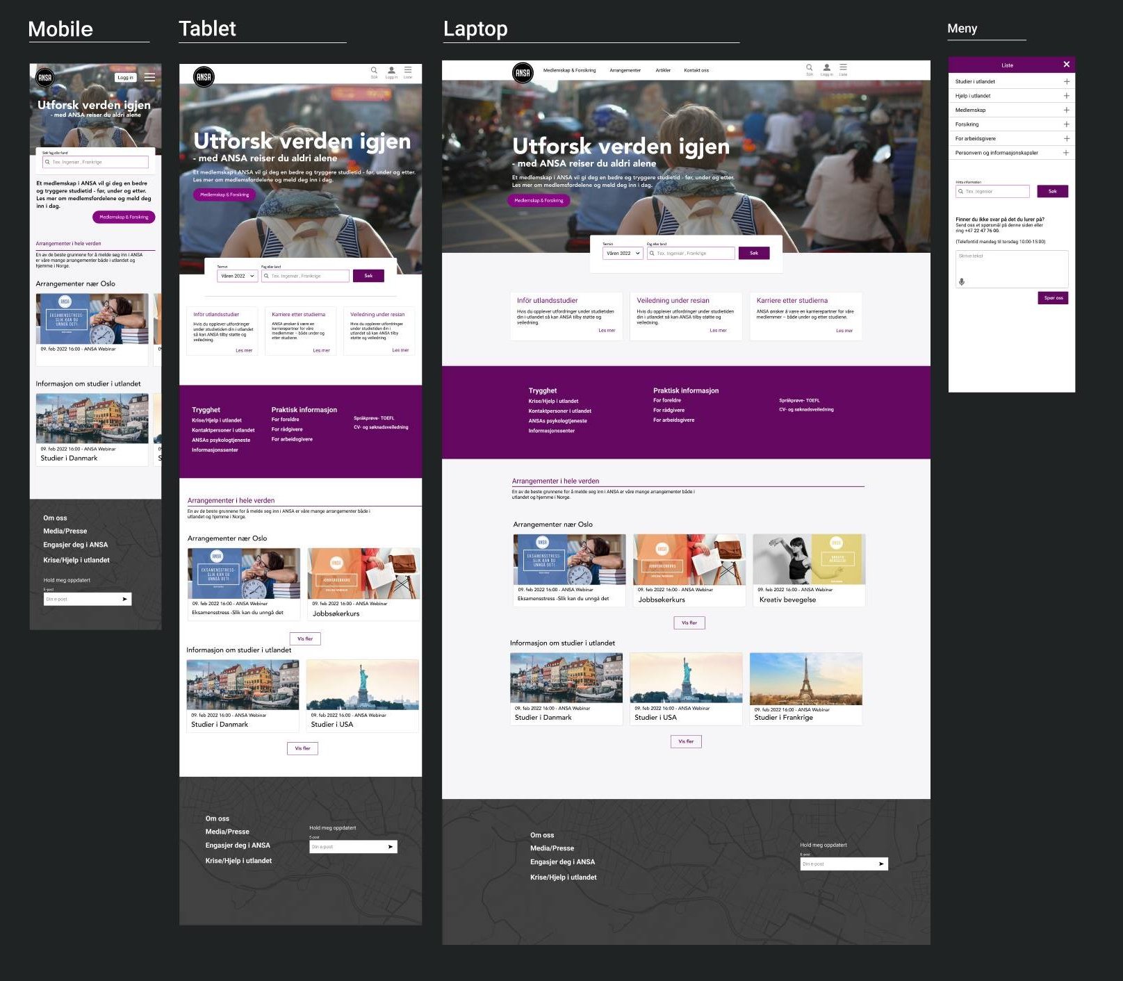
Sector
Travel, Education
Challenge
Rethinking ASASs websigt to be more engaging and accessible for students.
My Role
Information Architecture, Webdesign
Project Time
3 weeks
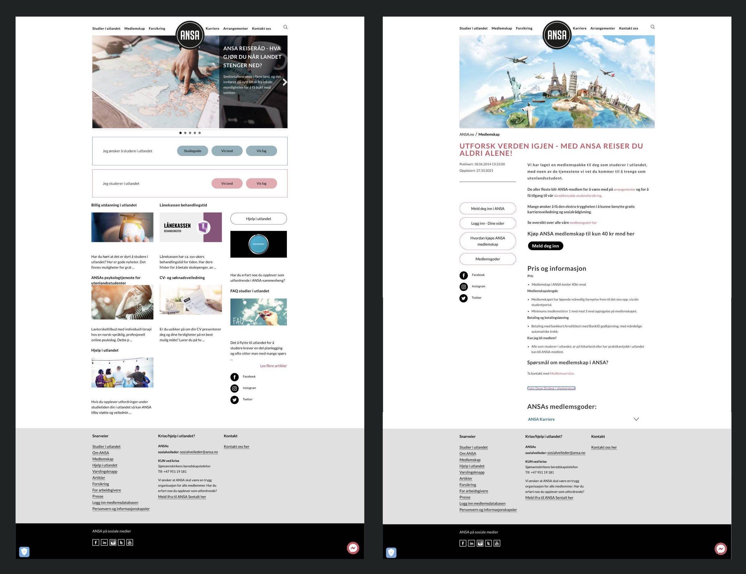
ANSA identified a need to modernize their webpage, recognizing it as outdated. They sought to enhance its intuitiveness and engagement through improved hierarchy and design. They therefore reached out to various design firms to solicit proposals for a procurement. Below are screenshots of the old UI.
With a three-week timeframe, there was no time to conduct extensive research. If given more time, our team would have wanted to conduct additional research about the target group and market competition.
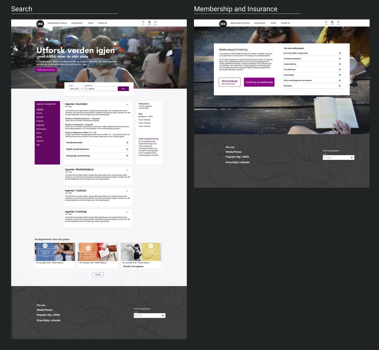
After discussions with the stakeholders, we identified that our main focus should be on facilitating students to easily sort by country and education, as well as registering for insurance
We organized a team workshop, making an affinity diagramm to dissect key elements and pinpoint pain points and prioritizing clusters. Through this, we determined the necessity of prioritizing enhancements to the search function, student events, and insurance information.
Incorporating the education-search bar and a membership button within the main header enhances accessibility and guidance for students navigating the page. Additionally, comprehensive step-by-step instructions for membership,
along with frequently asked questions, are provided in dropdown menus.