Sector
Inhouse project
Challenge
How can we attract more people to apply to Bredvid? Can we create a more modern layout that captures the company culture.
My Role
Information Architecture, Webdesign, Branding
Project Time
2 months
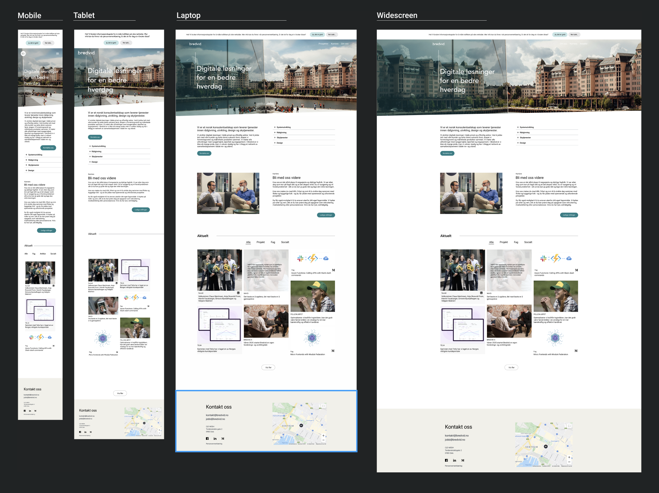
Bredvid saw the need to update its website to better reflect its growing brand and company culture. The goal was to create a site that not only provided essential information but also highlighted the company’s core values: fostering a strong, employee-focused community, showcasing impactful projects, and offering an inviting career path for potential talent.
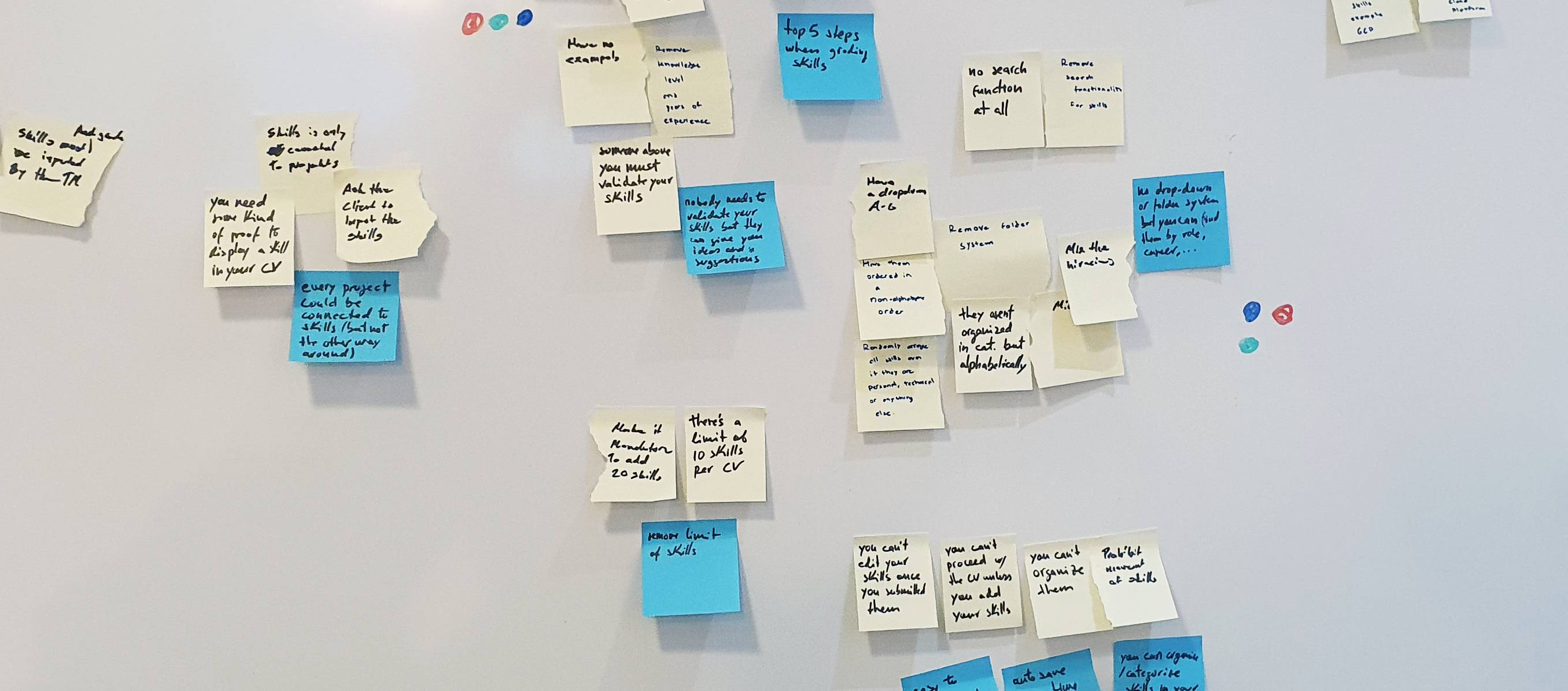
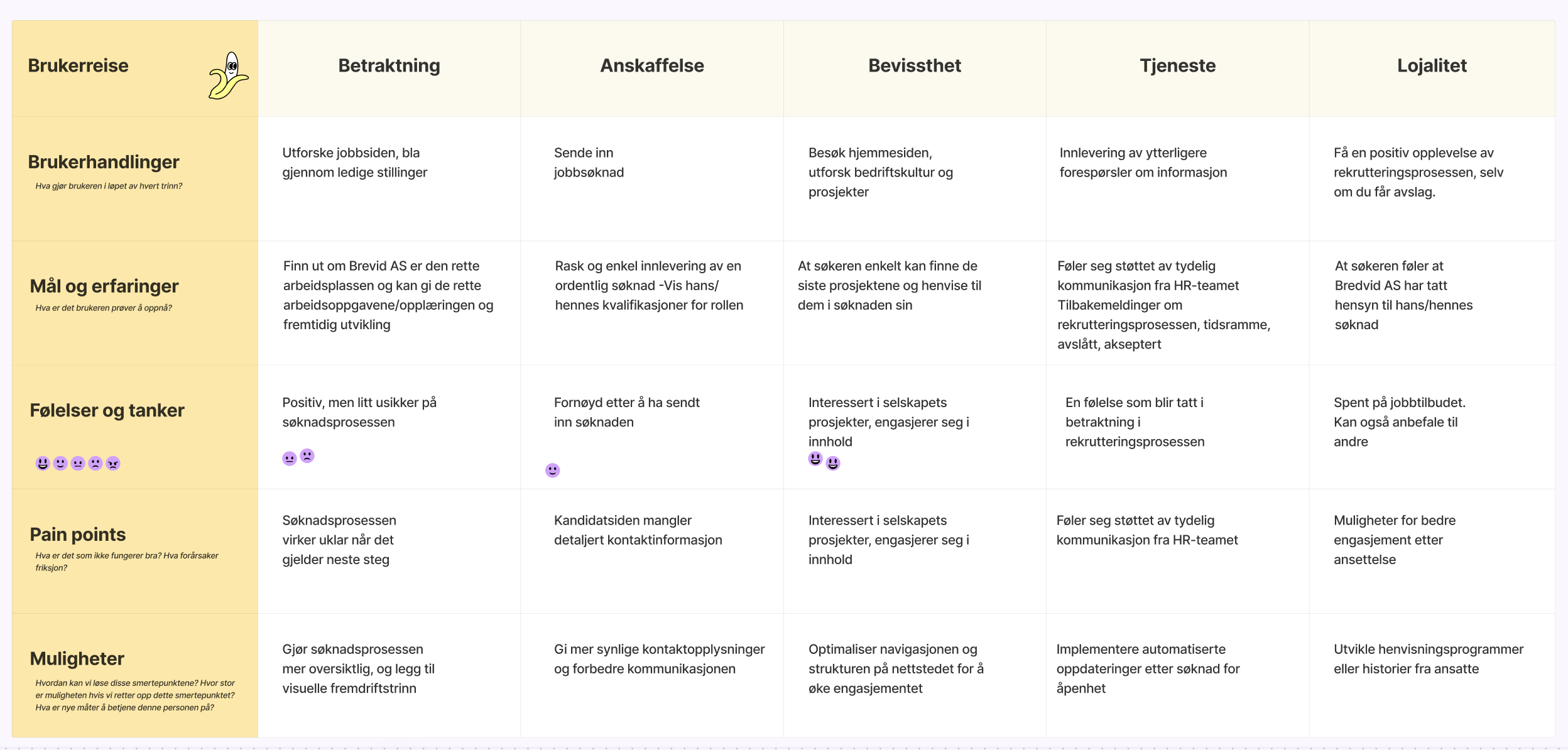
We started by interviewing management and HR to get a clear understanding of the company’s vision, goals, and expectations. In addition, we analyzed competitors to identify best practices in recruitment and community building. After that, we conducted an affinity mapping session, organizing the data into clusters to better highlight key pain points. From this,
we discovered that the site’s navigation could be improved, and that Bredvid's community needed more emphasis.
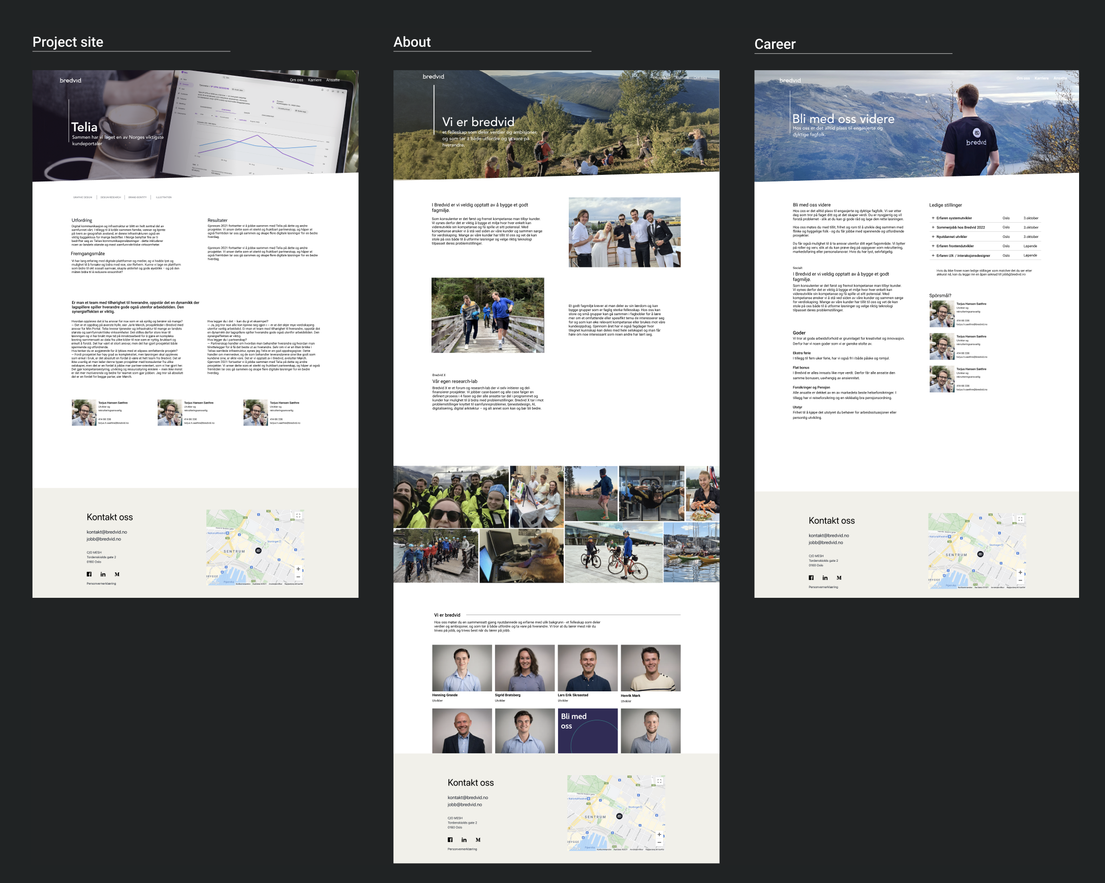
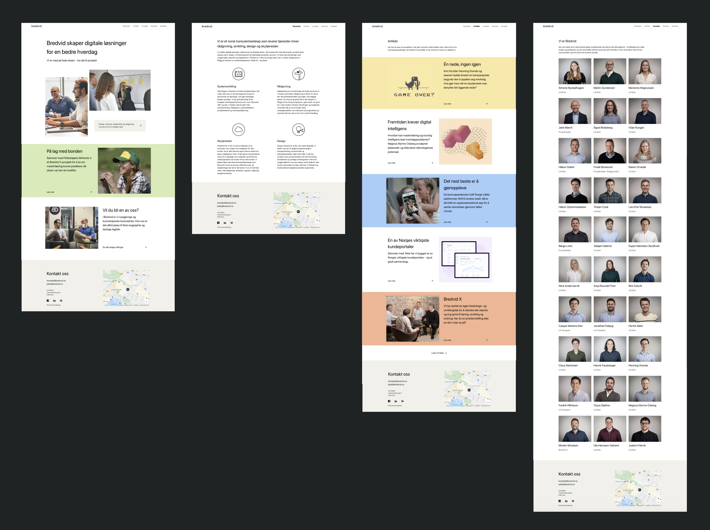
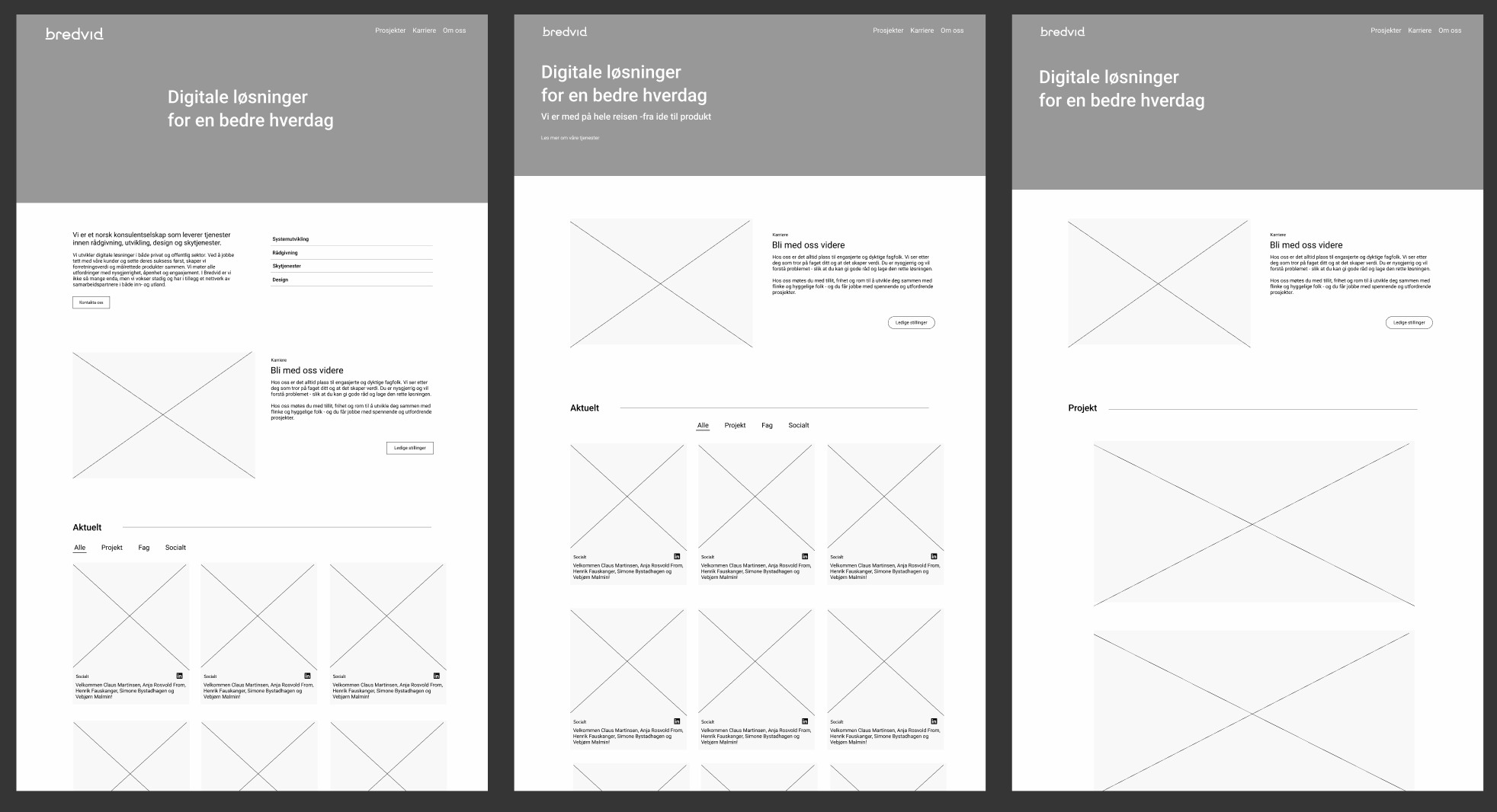
We designed wireframes for the key pages, ensuring they matched the newly defined site structure. For instance, the Home Page featured a section that introduced Bredvid’s team and values, followed by highlights of projects and career opportunities. On the Careers page, we focused on showcasing open positions and emphasized the company’s culture through employee testimonials and detailed recruitment process information. Once the wireframes were approved, we developed high-fidelity, interactive prototypes to demonstrate how users would navigate the site, especially in more complex areas like job applications.
Our aim for the visual design was to strike a balance between modern and approachable. The Careers section, in particular, featured bold call-to-action buttons, making it easy for users to apply or explore the recruitment process. We prioritized accessibility throughout to ensure the site was inclusive and user-friendly for everyone, regardless of ability. Due to COVID-19 restrictions, usability testing was conducted remotely. The feedback from interviews and testing showed that the new site was more intuitive and easier to navigate. However, we noticed room for improvement on the candidate page, especially when it came to highlighting contact details and streamlining the
job application process. Based on this input, we redesigned the candidate section to better meet user needs.