
Sector
Management
Challenge
Redesign the menues and streamline the user flow
My Role
Information Architecture, Webdesign, Branding
Project Time
4 weeks
dNodes is a web-based tool that helps companies visualize variables, streamline decision-making, and develop strategies. A developer on my team noticed that the menus lacked clear structure and were taking up too much screen space. However, at the time, dNodes did not see the need for a UX/UI designer. Despite this, the developer and I dedicated a few hours to creating a draft prototype, which we presented to the dNodes team. They responded positively to the new layout, and as a result, I was hired to continue my work for an additional four weeks.


The layout appears more compact and slightly cluttered, with large sidebars and a densely populated control panel. The left-hand sidebar takes up excessive space with oversized icons, while the right control panel is overwhelming with numerous sliders and toggles. This creates visual clutter and makes it harder for users to interact efficiently with the tool. The color scheme in the old design is more subdued and lacks clear visual hierarchy, making it difficult for users to prioritize information. The interaction elements, like tooltips and node settings, are smaller and cramped, further reducing clarity.
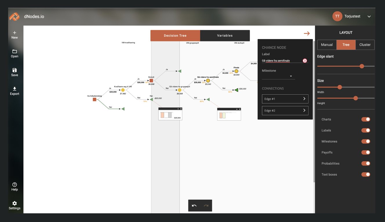
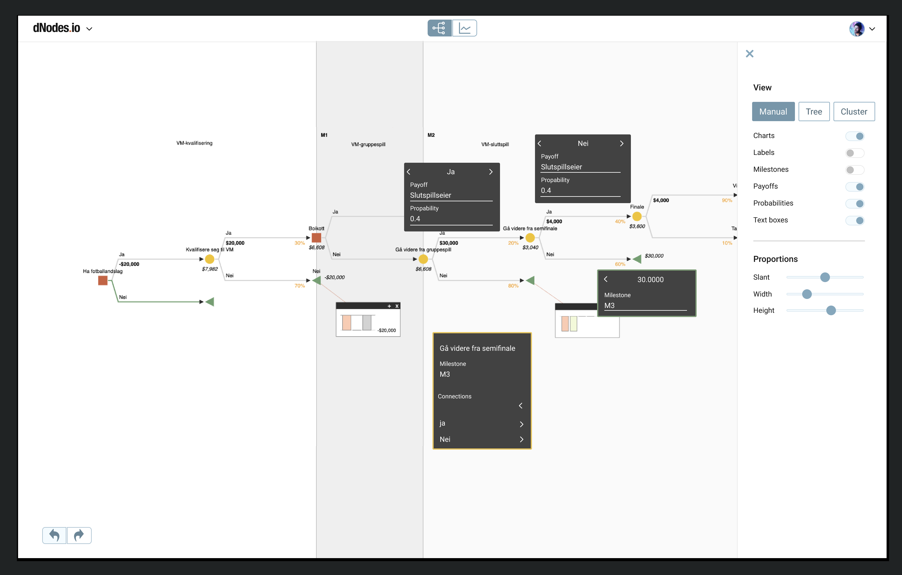
Due to the limited time frame, we did not have the opportunity to complete a full UX process. We mapped the different features and functions in the application, and evaluated as well as grouped them. We also noticed that the orange color of the buttons drew too much attention away from the table, so we tested using a blue color scheme instead. For an application primarily used in presentations, this made a significant difference in clarity. The buttons, toggles, and fonts were adjusted in size according to Google Material guidelines, and we built a component library in Figma as a foundation for a future design system
The new design introduces a more breathing space and a cleaner layout. The sidebar and navigation elements are streamlined, reducing distractions and providing more focus on the decision tree. The right control panel is reorganized with clearer labels, improved spacing, and fewer but more intuitive controls, allowing users to customize variables and layouts more easily. The visual hierarchy has been significantly enhanced with modern typography and more distinct colors, making it easier for users to interact with important elements and interpret data. The toggle controls for features like charts, labels, and milestones are better organized and spaced, improving their usability. I also sugested a new feature for highlighing selected path.
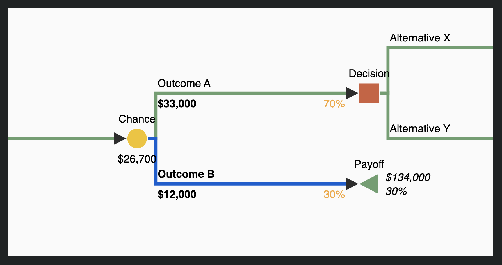
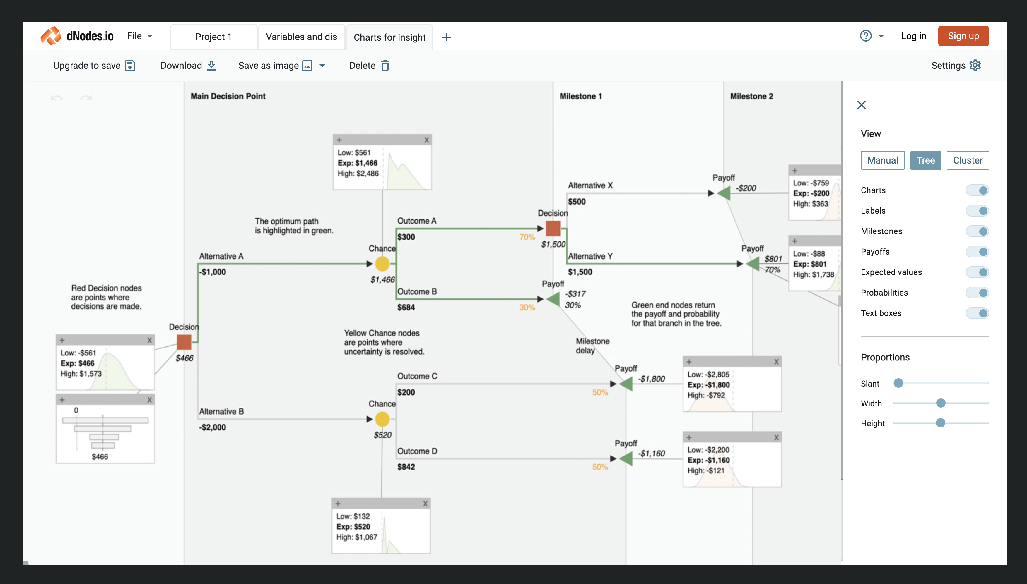
I was pleased to see that they had further improved the design and even developed some new features. It showcases the significant difference that just a few weeks of focused design and structure can make for a company.
Following our work with dNodes and the positive feedback we received, the developer and I began researching the possibilities for a new B2B service aimed at start-up companies. Our goal is to help smaller businesses that might not be able to afford a full design sprint or extensive research by offering design adjustments focused on improving usability, based on established design practices (such as Google’s Material Design). While this service doesn’t replace a comprehensive design process, it provides a solid starting point and structure for further UX research. It also serves as a way for Bredvid to build strong B2B relationships for future opportunities.